What are the top python libraries for data science?
Data science allows us to explore, analyze and understand the vast array of phenomena, behaviors and contexts that surround us.
With several options available, it is possible to get lost in trying to define the ideal tool, language or library for each case.
For other DS topics go to the SR channel or articles such as careers in data “Where to start a career in data?”
Python is indeed the first choice for the Data world. But which libs to use?
In this case we will check some of the libs that make up an ecosystem full of powerful and versatile libraries.
What are the main python libraries for data science that we will cover?
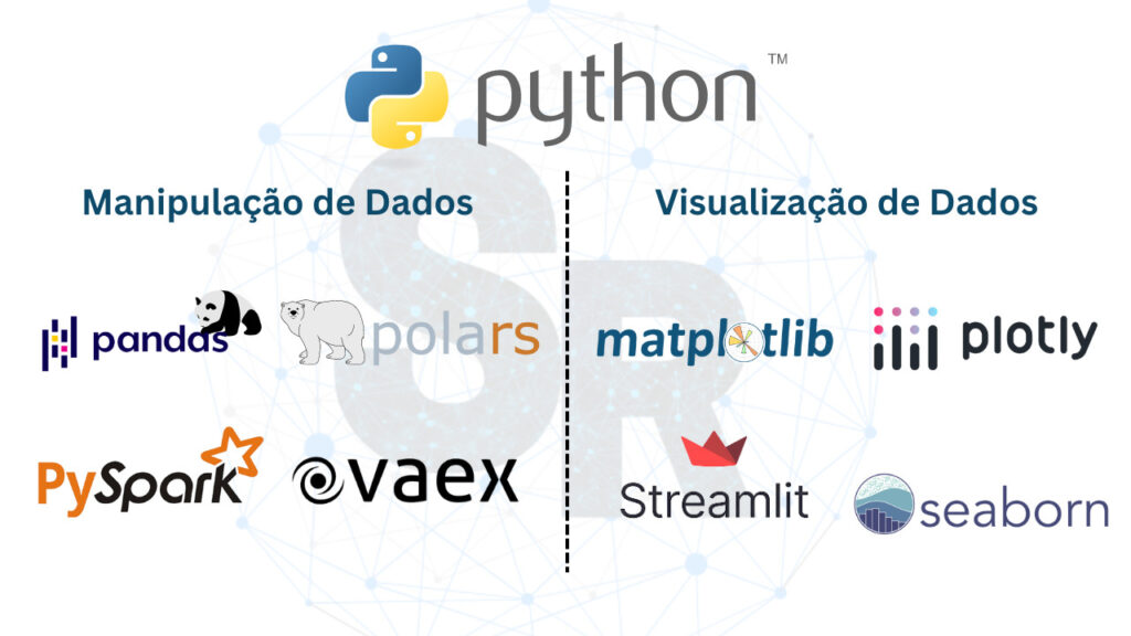
We will focus on libs designed especially for data manipulation and visualization.
Through these tools, we will be able to extract valuable insights, create compelling visualizations and tell stories that involve our customer from our data.
The skill of a well-told story is called Storytelling.
Let’s explore the main Python libraries and APIs for Data Science!
Exploring Data with Python
Whether you are a scientist or a data analyst, our work revolves around analyzing and understanding data related to a business, or another area of knowledge.
And to make this process more efficient and enjoyable, we have some of the best data manipulation and visualization libraries in Python.
In this article, we’ll explore some of the most powerful: pandas, polars, vaex, pyspark, matplotlib, plotly, and seaborn.
Let’s start with data manipulation. What are the top data science python libraries for data transformation?
Python Data Science Libraries: Data Manipulation and Processing
Pandas Library: Mastering Data Manipulation
The pandas library is one of the most beloved and essential for any data scientist.
It offers us versatile data structures like DataFrames and Series, which facilitate manipulation and analysis of tabular data.
With pandas, we can perform a number of tasks linked to the Data Transformation process (emt ETL), such as:
- Data cleaning,
- Handling missing values,
- Aggregation of information,
- Filtering,
- Ordering
- Conversion to other frameworks and more.
The alignment of data based on index labels is one of the great advantages of the library.
In this way, we manage to avoid many of the usual data manipulation headaches.
Below you will have a small example in python with pandas.
import pandas as pd

# Create a simple DataFrame
data = {'Name': ['John', 'Maria', 'Pedro', 'Ana'],
         'Age': [25, 30, 22, 28],
         'City': ['Sao Paulo', 'Rio de Janeiro', 'Belo Horizonte', 'Brasília']}
df = pd.DataFrame(data)

# Display the DataFrame
print(df)

# Calculate the average age
average_ages = df['Age'].mean()
print("Average ages:", average_ages)
In addition to data processing, we can use pandas to perform calculations with descriptive statistics, such as mean and standard deviation.
In addition it is possible to create or create bar graphs and histograms. This is very useful during a data exploratory process. Or even in a preliminary analysis.
Library Polars: The Efficient Alternative with Performance
When dealing with large datasets, pandas can have performance limitations, especially regarding memory consumption.
For these cases the polars library comes into play.
Polars is a modern library, written in Rust with high power for manipulating tabular data in low memory scenario.

Like pandas it works with dataframes. However, it performs better in scenarios with higher data processing load.
This goesntage takes place through the lib to take full advantage of parallelization and efficient data processing.
Polars is an ideal choice for CPU operations, resulting in a significant increase in the processing speed of large volumes of data.
Below you will have a small example in python with polars.
import polars as pl

# Create a simple DataFrame
data = {'Name': ['John', 'Maria', 'Pedro', 'Ana'],
         'Age': [25, 30, 22, 28],
         'City': ['Sao Paulo', 'Rio de Janeiro', 'Belo Horizonte', 'Brasília']}
df = pl.DataFrame(data)

# Display the DataFrame
print(df)

# Calculate the average age
average_ages = df['Age'].mean()
print("Average ages:", average_ages)
Our next lib also works with a high data load.
Vaex Library: Speed and Efficiency for Massive Data
If efficiency is the key to handling gigantic datasets, vaex is an interesting lib for your case.
This library delivers amazing performance, allowing you to work with data of colossal dimensions with ease.
Due to the use of asynchronous computation and lazy evaluation in performing operations with data, it operates quickly and efficiently.
In addition, it operates without hogging system memory. This makes vaex a high-performance option for manipulating Big Data in Python.
The only point of attention is related to lower adherence in a production environment. The most famous libraries like pyspark gain prominence in this case.
Below is a python example using vaex.
import vaex

# Create a simple DataFrame
data = {'Name': ['John', 'Maria', 'Pedro', 'Ana'],
         'Age': [25, 30, 22, 28],
         'City': ['Sao Paulo', 'Rio de Janeiro', 'Belo Horizonte', 'Brasília']}
df = vaex.from_dict(data)

# Display the DataFrame
print(df)

# Calculate the average age
average_ages = df['Age'].mean().item()
print("Average ages:", average_ages)
Pyspark Library: Scalability and Distributed Processing
When your data size exceeds the limits of a single machine, pyspark is the solution to handle distributed processing in a cluster.
This library is based on the Apache Spark platform and provides a user-friendly interface to perform Big Data manipulation and processing tasks.
When it comes to parallel processing of data, pyspark is the first option on the list. It’s the same with the Spark system.
Pyspark offers powerful features such as parallel task execution, SQL support, machine learning, RDDs (Resilient Distributed Datasets), in-memory processing, and streaming processing.
This combination of scalability and ease of use makes pyspark a valuable choice for large-scale data analysis.
Below you will have a small example using the pyspark lib in python.
from pyspark.sql import SparkSession

# Start a Spark session
spark = SparkSession.builder.appName("Example").getOrCreate()

# Create a simple DataFrame
date = [('John', 25, 'Sao Paulo'),
         ('Maria', 30, 'Rio de Janeiro'),
         ('Pedro', 22, 'Belo Horizonte'),
         ('Ana', 28, 'Brasília')]
columns = ['Name', 'Age', 'City']
df = spark.createDataFrame(data, columns)

# Display the DataFrame
df.show()

# Calculate the average age
average_ages = df.selectExpr("avg(Age)").collect()[0][0]
print("Average ages:", average_ages)
What are the top data science python libraries for data visualization?
Python Data Science Library: Data Visualization
Data visualization is a critical part of the data analysis process. We need to pass the information to the client, otherwise it’s the same as not running the job.
Library Matplotlib: Customization and Versatility in Charts
The matplotlib library is one of the most popular libraries for data visualization in Python.
It offers a high degree of customization and versatility in defining graphics. We were able to create professional looking reports that met our client’s needs.
I believe it was one of the first visualization lib I used. Ideal for creating reports with charts and static data.
If you need interaction, and “life” in your data, I advise you to explore libs, such as: Streamlit and Plotly.
Below you will have a small example of using matplotlib with python.
import matplotlib.pyplot as plt

# Data for the bar graph
cities = ['Sao Paulo', 'Rio de Janeiro', 'Belo Horizonte', 'Brasília']
population = [12252023, 6747815, 2512072, 3055149]

# Create the bar chart
plt.bar(cities, population)

# Add title and labels
plt.title('Population by City')
plt.xlabel('Cities')
plt.ylabel('Population')

# Display the chart
plt.show()
Plotly library: Interactive and Dynamic Visualizations
While matplolib is ideal for static reporting, plotly is dynamic and low code.
As a powerful open source Python library, plotly offers advanced features for creating interactive and dynamic visualizations.
We can create interesting and interactive visuals in 2D and 3D, allowing the exploration of data from different perspectives. In addition, we can even create Apps!
This way, you empower the user in the journey through the data. He chooses the required level of detail.
Reports become customizable and objective.
Its integration with other Python libraries, such as pandas and matplotlib, facilitates the manipulation and customization of graphs.
In addition, Plotly is highly customizable, making it a valuable tool for data analysts who want to communicate their results in an engaging and informative way.
Below you can see an example of using plotly.
import plotly.express as px

# Data for the scatterplot
x = [1, 2, 3, 4]
y = [10, 15, 13, 17]
labels = ['Point 1', 'Point 2', 'Point 3', 'Point 4']

# Create the scatter plot
fig = px.scatter(x=x, y=y, text=labels)

# Add title and labels
fig.update_layout(title='Scatter plot',
                   xaxis_title='X axis',
                   yaxis_title='Y axis')

# Display the chart
fig.show()
Library Seaborn: Creating Impactful Visualizations
Seaborn is a Python data visualization library built on top of Matplotlib with a statistical focus.
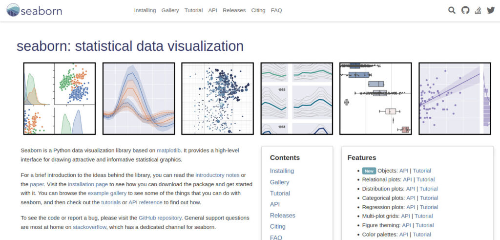
It provides a high-level interface for creating attractive and informative statistical graphs. Seaborn is designed to work seamlessly with pandas DataFrames and arrays, making it easy to visualize complex datasets.
The library offers a wide variety of chart types, including scatter charts, bar charts, box plots, heat maps, and more. These are more elaborate options that reflect more complex analyzes of the data.
One of the main advantages of Seaborn is the ability to create visually appealing graphics with just a few lines of code, below you will have an example in python.
Furthermore, Seaborn offers tools to easily customize and adjust the graphics according to requirements and their variations.
import seaborn as sns

# Data for the scatterplot
x = [1, 2, 3, 4]
y = [10, 15, 13, 17]

# Create the scatterplot using seaborn
sns.scatterplot(x=x, y=y)

# Add title and labels
plt.title('Scatter Graph')
plt.xlabel('X axis')
plt.ylabel('Y axis')

# Display the chart
plt.show()
How to choose the right lib for your python project?
With so many options available, it’s important to know how to choose the right library for your project.
Consider factors such as the size of the data you’re working with, the efficiency and performance you want, the specific functionality you need, and the library’s ease of use.
Try different libraries, see how they suit your needs and choose the one that best fits your project.

Juliana Mascarenhas
Data Scientist and Master in Computer Modeling by LNCC.
Computer Engineer
Read other posts by SR!
Want to know more about Career in Data?
Access the videos on our YouTube channel Simplificando Redes

Email Server & Webmail Setup: Postfix, Dovecot, SnappyMail
Install Ubuntu Server 26 on VirtualBox (Step-by-Step)

How to Configure NAT in Packet Tracer (Step-by-Step)

Zabbix FIM: How to Setup File Integrity Monitoring
Configure DHCP in Packet Tracer: Server & Router Guide